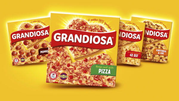
MAINTAINING MARKET LEADERSHIP
For over 40 years Grandiosa has been deeply rooted in Norwegian culture. Fast forward to today, the freezer has become more competitive with foreign and home-bred competitors; Grandiosa needed to retain their current position as the Norwegian market leader and to grow brand loyalty amongst a younger audience. The ambition was for “Everybody to have a sweet spot for Grandiosa, but GenZ should love it”.
Grandiosa were looking for a new, fresh, and modern visual identity including a design that revitalised Grandiosa’s Core product portfolio. The design had to ensure an improved brand blocking in the freezer, as well as maximise temptation.
AMPLIFYING BRAND SIGNIFIERS FOR THE NORWEGIAN MARKET
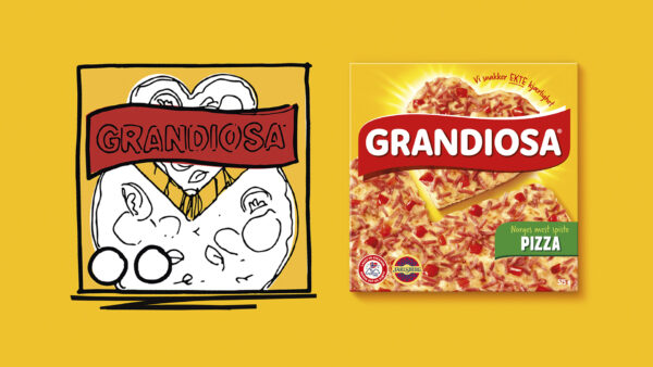
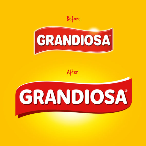
Brand signifiers amongst existing consumers and our unique knowledge of the Norwegian market identified that the iconic heart slice, yellow brand colour and red banner was intrinsic to a successful design. Boldly centring the heart and linking this to the brand slogan “We are talking real love” refreshed the design in a way that connected with the original packaging from 1980 – whilst creating easier application of a simplified brand logo and relevance for a new generation.
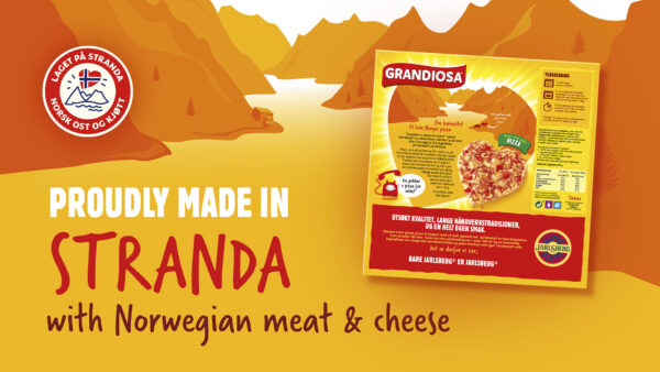
The new tempting product photography breaks out of the Norwegian category norms through its overhead angle and unique shape, increasing temptation and putting ‘real love’ proudly at the centre, giving real clarity and focus to the brand proposition. Wherever possible iconography and messaging was evolved to amplify Norwegian provenance as well as conveying the warm and inclusive brand personality – something important for the consumers.
PROTECTING BRAND IP
The revitalised redesign of this range has increased the effectiveness, navigation and use of the iconic assets. This was not only to connect with a new GenZ but to also increase IP ownership of the heart shape slice and yellow brand colour whilst enhancing the brands approachable and uncomplicated personality.
KAJA MARIE LERFALDET – MARKETING, ORKLA FOODS NORGE