A TIRED BRAND LACKING GROWTH OPPORTUNITIES
In an increasingly competitive confectionery sector, the much-loved Dumle brand was lacking taste, enjoyment and a connection with its fans. The brand architecture and design wasn’t set up to support the growth into new categories and segments therefore missing out on attracting new consumers and building sale frequency amongst its existing consumer base. The brand required an update that would allow everything to ‘stick together’ through the joyful connection of its iconic assets.
A CREATIVE IDEA WITH A SHARED CONNECTION
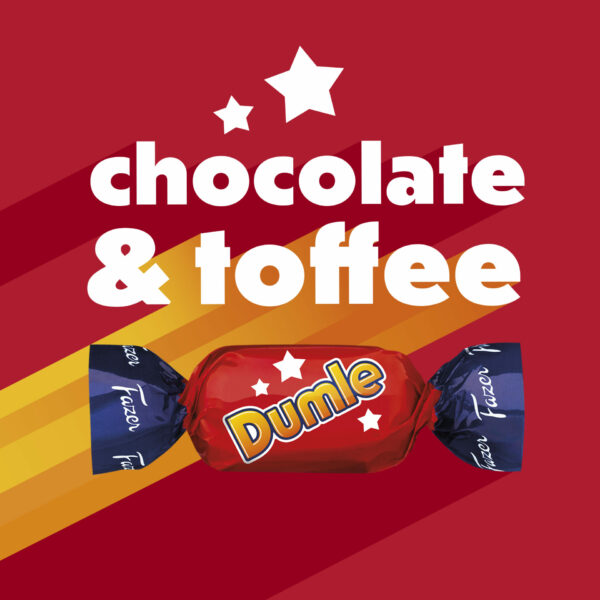
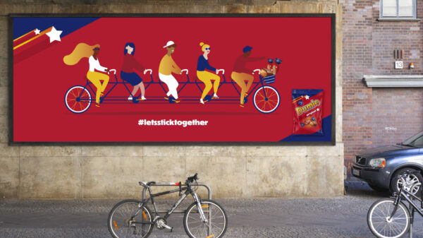
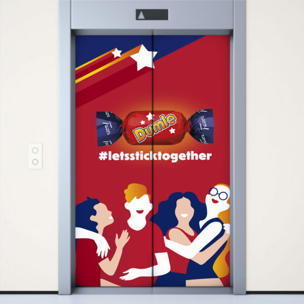
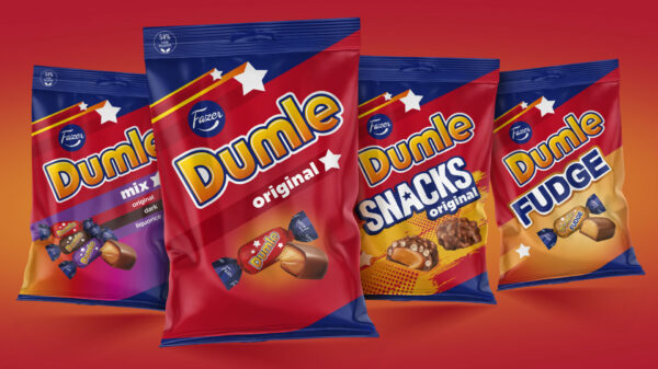
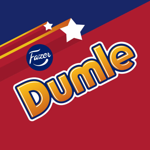
Combining a product truth with the consumer insight of a shared connection, the creative start point for the redesign was ‘joyful connection’. Modernising the design with bold graphics to increase standout and printability whilst joining the iconic assets together in an uplifting and powerful design. Retaining recognisability and dialling up taste – something important for the consumers.
SUCCESSFUL SEGMENTATION FOR DESIGN AND GROWTH
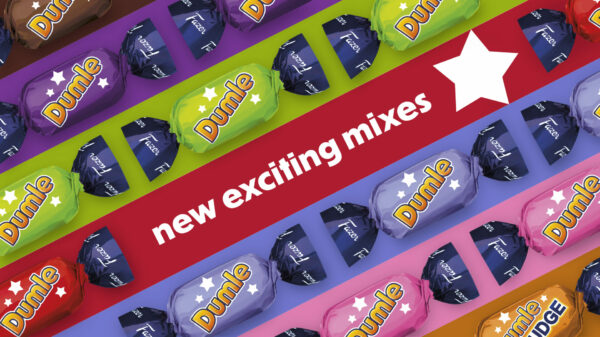
Reviewing the portfolio segmentation was as equally important to plan for brand growth as it was for pack architecture. Allowing for a design that can be easily navigated by consumers whilst allowing for the different packaging formats and future new product development. The design has a clear architecture with an area for branding, product descriptor and the product picture depicting the product experience in a more realistic delicious way.
INTRODUCING BRAND BLOCKING FOR THE FIRST TIME
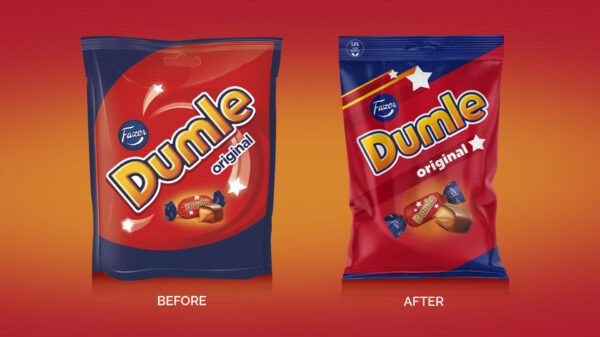
This new design successfully strengthens the iconic assets that have been in existence for over 75 years. The new design increases the red brand blocking and therefore the standout at point of purchase – this was non-existent in the previous design.
EXCITING RESULTS PENDING
In an increasingly competitive confectionery sector, the redesign of this iconic brand successfully increases taste, enjoyment and a connection with its fans, which was supported by extremely positive research results in the existing markets of Finland and Sweden. Launching in August 2023 across over 45 skus – we cannot wait to see the brand grow from strength to strength with multiple NPD planned for the future.
IPSOS 2022
AN ICONIC MODERNISATION
The redesign has delivered a modernised visual identity and packaging range, creating assets that are much more engaging than the previous design – creating a brand world that now effectively supports the brand platform. The design architecture reaches out and makes it easy to navigate for the brands ‘fans’ and allows for new innovations with increased taste and stand out.