
HEIGHTENED SENSES MAGNIFY ROLE OF DESIGN
It’s a fundament of biology that in crisis mode our bodies and minds respond primitively in order to survive, as a priority. Stress hormones kick in and while digestion, fertility and even sleep may be somewhat deprioritised, all our senses are heightened. Our sight is enhanced, touch is ultra-sensitive, our sense of smell and sound magnified, on red alert, scanning for danger and strategising to safety.
Right now, in this unprecedented time of crisis, we have a unique opportunity to observe consumers’ responses to semiotics on packaging in action. A key goal in commercial design is to manipulate an emotional response resulting in purchase and usage. Multi-sensorial design is already inherent in our day to day work in the studio, a lot of it is instinctive from experience but most is based on various forms of feedback – whether face to face, qualitative, neuroscientific, quantitative, and then via the ultimate response of the sale.
In the initial phase of the crisis, we saw home and personal hygiene products eradicated from the shelves, stockpiled far beyond a rational response to meet even midterm needs.
CLEAR SIGNIFIERS FOR PROTECTION
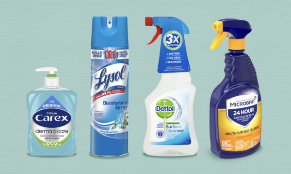
When we look closer at these categories, we see visual and verbal codes that play to our demand for self-protection and defence. Overall when we look at NHS brand in UK, Lysol in US, Domestos, Carex, even McAffee anti-virus software – we see blue. We know blue is trusted. It sanitises. It is evidence of cleanliness and clinical dependability. Typeface is more diverse, from authoritarian capitals to heritage signatures of proven efficacy, and softened lower case for approachability. All are legible and accessible and interestingly frequently reversed out in a sterile white, emphasising the “hospital” blue. Red as a spot colour is interesting to balance out a pack aesthetically but used so sparingly it emphasises the aggressive potency of the product and also alert us to danger. We see this is on the Domestos and Dettol lids/spray points warning us not to drink it, in the Lysol “kill” word and McAfee crest. The other colour of protection is green, also chosen for paramedics’ uniforms in the UK. According to the Ambulance Service, following several serious incidents, their uniforms were changed from blue to differentiate them from police and therefore protect them from attack. Less prolific than blue in the aisle, green is a standard of both exit signs and first aid because it communicates safety and calm.
THE WINNERS
Dettol is arguably the most successful brand of them all and is still as elusive on shelf as a unicorn. Dettol incorporates all the above visual assets as well as featuring a key band equity of the roundel and dagger. The assets in the protection category mostly tend to borrow shields, arrows and medical crosses, emphasising a balance of both “attack” and “defence”.


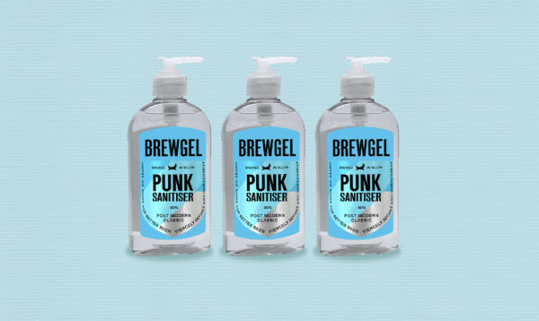
P&G Microban launched at the beginning of “the crisis”, also taps into all these codes, borrowing yellow from danger signs and ambulances themselves to differentiate. Brew Dog on the other hand sticks to blue, black and white for their quick response hand sanitiser, overall a masterclass at owning category codes through the brand and successful at an appropriate response for a modern, agile, connected brand.
More than simply a marketing ploy of colours and fonts, at times like this we can see that people subconsciously look to design to lead them to protect themselves and their families. Design has a vital role in helping people navigate their way to safety and a vital role in this crisis today.
Take a look at your brand and ask yourself if its visual codes and equities are resonating with a clear emotional consumer need? If things aren’t working as they should be, then your challenge sounds familiar to us. And we can help.