28 MAY 2020

SEEKING THE WARM LOVING COCOON OF COMFORT
At the onset of the crisis, in the dark fear of the unknown, we sought, bought, and hoarded brands and products that offered us protection. However amongst the shields and daggers, hospital whites and sterile blues was a whole other world of reassuring retro patriarchal icons, and the warm, caring cocoon of brands offering us Comfort.
Comfort is complex. All brands by their mere existence are comforting but the specific Comfort we’ve had a look at covers the cosy reassurance of a safe, familiar, loving place you find on a supermarket shelf.
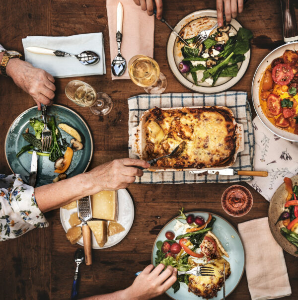
We’re scared, locked down at home, making and eating at least three meals a day, which calls for a constant and reliable source of this easy reassurance. Beyond cosiness, Comfort also means low price, longer shelf life, generous portions to share and guaranteed quality and taste. No surprises there are dramatic spikes in retail sales from brands offering products such as soup, canned meat, frozen foods, gravy, pasta, and pasta sauces; meals, ready to go, definite to please.
MADE BY OUR GRANDPARENTS
Visually, we see these needs translate into a set of stable and familiar symbols representing a world warm and safe, a world still turning on its axis, as it was in January, pre-Crisis.
Looking closer at Comfort codes on shelf, there are an abundance of reassuring typefaces – full, rounded, often serif, approachable and readable, as if hand written by someone’s mum. Knorr does this as does Campbells with a script that hasn’t changed forever, as far as the average person’s eye can see. And in the US, both brands report a substantial increase in sales across their portfolios. The palette of comfort is warm and generous with yellows, reds as in heart warming aaah Bisto gravy heaven, and optimistic orange we see in Warburtons sunrises on their record selling crumpets and loaves. Inviting retro shades and tones also feature such as the teal blue on Heinz baked beans tins, doing a romping trade at the moment.
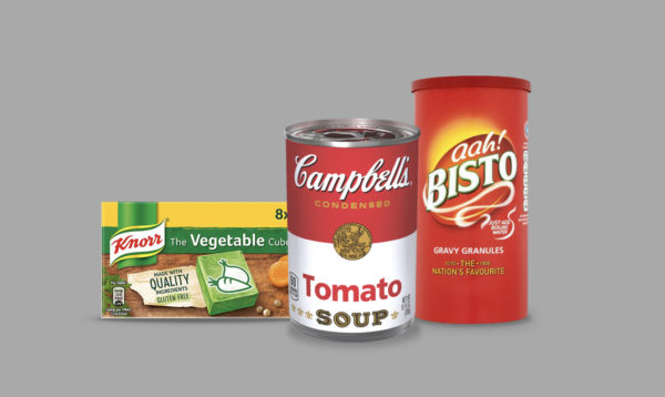
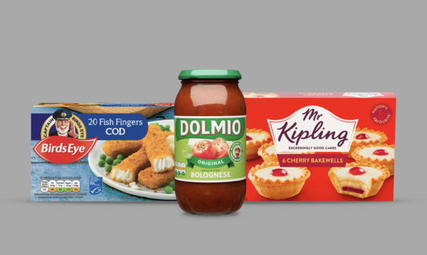
Comfort also shows up as faces and real people’s names, and men that might be friends with our grandparents. As patriarchal and old fashioned as it looks – think Dolmio, Captain Birdseye, Quaker Oats, Lloyd Grossman, Hellman’s, and Mr Kipling; safe hands delivering consistent quality and taste – and people who’ve been through a crisis before. The “people” part of Comfort brands is important to build that emotional connection and the old worldy grand pop feel is also (hopefully) more about longevity than only trusting a male icon. Although it is an interesting snapshot in time, that the leading heritage Comfort brands are so male dominated. If Comfort is about taste there are always delicious pictures of ingredients and meals; luscious tomatoes, fresh herbs, and noodles oozing cheese, or a wafting aroma tickling our taste buds.
TURNING TO MAC N CHEESE TO SAVE US
Speaking of noodles, the big winner, in the US, is Kraft Heinz, seeing its first rise in share price for a long time. The name “Kraft”, a teeny lozenge stamped on pack across an expansive portfolio, is enough of a sign post to draw the brand in close to our bosoms to save the day. Born in 1937, during the Great Depression, Kraft understands a crisis possibly more than any other brand. And it has proven itself a reliable source of Comfort since.
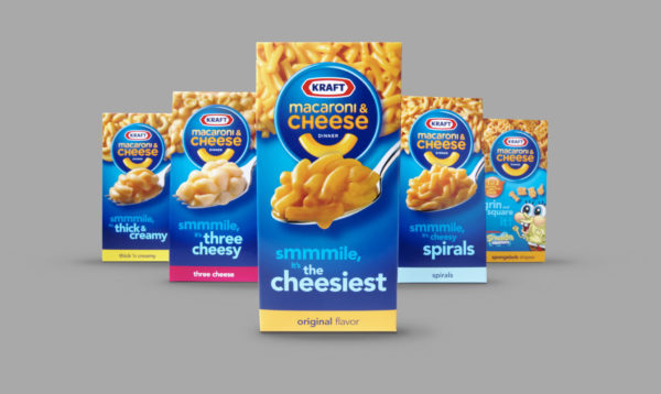
Kraft mac and Cheese in particular is booming, and apparently some factories are working three shifts a day to meet increased demand. With a shelf life of eons, a gooey calorific pile of noodles on the iconic blue pack, and a promise to be ready in 15mins, Kraft mac n cheese is a Comfort no brainer. Birds Eye wins for similar reasons but in the frozen aisle. It seems anyone vaguely nostalgic for a time without an invisible killer virus around, is giving newer, “healthier” brands a momentary reprieve, proving taste overrides calories or naturalness in a crisis. And heritage overrides everything else…
Comforting design codes go beyond visual cues to include sound and touch. We’re hearing soothing sound tracks in advertising such as Cathedral City’s ad featuring Home by Dan Croll, which explains the chunks of the brand’s cheese on our sandwiches today. Comfort is about togetherness and nurturing. It is about love. Easy, cost efficient, long lasting, warm, carbohydrated love that’s been around a while. Brands that own this space already are winning, but all brands can play their part. We need it more than ever.
Take a look at your brand and ask yourself if its visual codes and equities are resonating with a clear emotional consumer need? If things aren’t working as they should be, then your challenge sounds familiar to us. And we can help.