THE NEED TO DRIVE BRAND GROWTH THROUGH POSITIONING AND DESIGN
Alku’s challenge is to drive brand growth via increased ease of purchase, improved mental availability and an optimised portfolio. The brand required a succinct brand positioning with relevance and identity that connects with the consumer – allow for ease of navigation something important for consumers to find what they are looking for but more importantly NPD innovation.
UNDERSTANDING CONSUMER NEEDS FOR DIFFERENTIATION
The key for success was to really understand the consumer and their needs and motivations at point of purchase. It was reassuring to find out, that these consumers seek up-to-date exciting nutritious flavour experiences that they can easily navigate on shelf – something that Fazer Alku can deliver above and beyond the competition. These modern flavour seeker consumers expect exceptional taste which is essential to note for design.
CREATING A CREDITABLE BRAND POSITIONING
With most of the category positioned around various versions of local Finnish grain. There is a real opportunity to cut through with a brand that creates a better breakfast for a more unforgettable day.
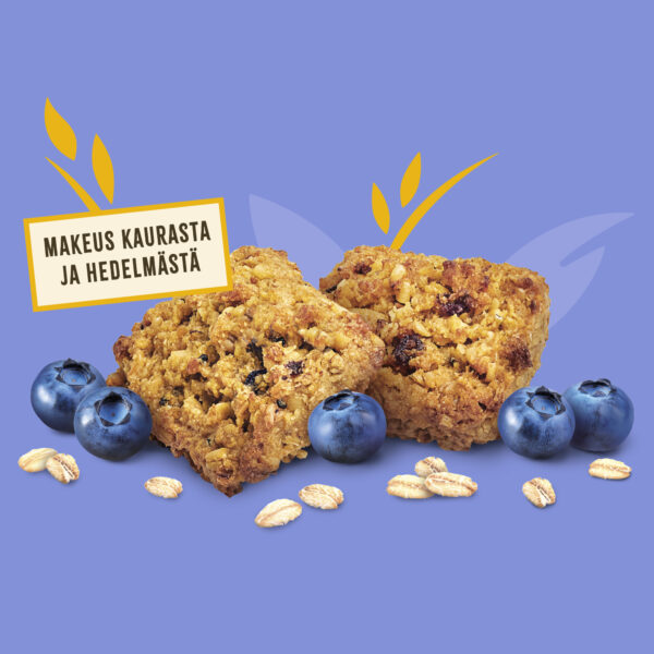
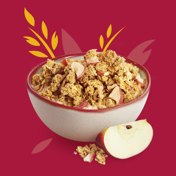
The idea for Alku was Finnish creative grains which is creditable, believable, and ownable in category – a point of difference from competitors. Alku inspires new and existing generations to re-engage with the wellbeing benefits of grains and uplift mornings with unforgettable modern tasty moments from Finnish grain.
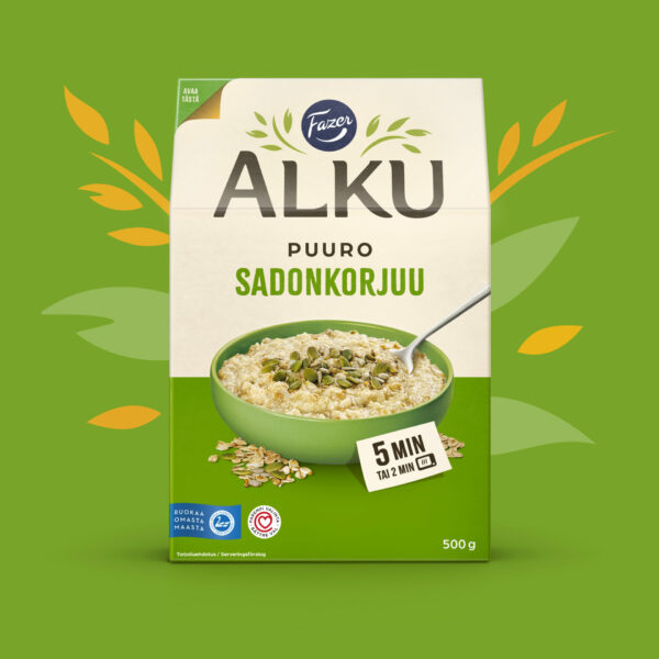
MODERN AND EXCITING DESIGN
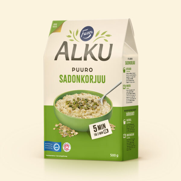
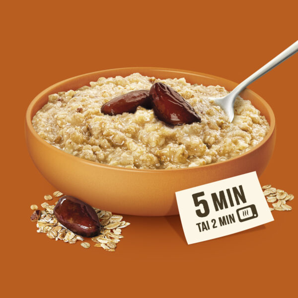
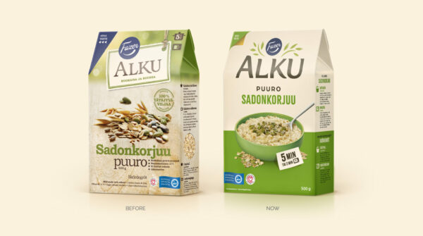
The brand mark has been crafted to stand out and be seen on shelf whilst also incorporating uplifting grains. Navigation has been improved by introducing tasty naturally bright colours and ensuring each aspect of communication is consistently placed on pack. The illustration style and assets bring to life the grains and icons in a modern fresh way. Accelerating and uplifting the whole brand experience – an exciting, differentiated and refreshing change to the whole category.
STANDING OUT SUCCESSFULLY
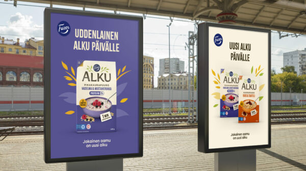
The launch of the new design has sharpened the brand position and promise for consumers by delivering an ownable and distinctive brand identity created with a “design to digital” approach. The portfolio architecture is single minded and logical with a pack design that drives the improved perception of increased quality and taste with ease for portfolio navigation and future growth in mind.
