OVERCOMING FRAGMENTATION FOR A COHERENT IDENTITY
Wyoming Whiskey’s organic brand growth led to a fragmented brand presence that had too many inconsistent asset options and a misaligned aesthetic when compared with its ‘rugged luxury’ personality. This lack of visual consistency hindered the brand’s ability to communicate its unique story effectively, especially as it sought to resonate with a more knowledgeable and engaged whiskey drinker audience. To achieve its prestige growth aspirations, the brand needed to strengthen and unify its identity, aligning it with the distinct values and expectations of its evolving target market.
THE INTEGRITY OF WYOMING WHISKEY
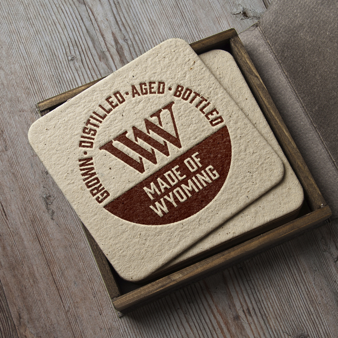
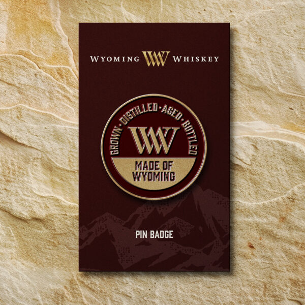
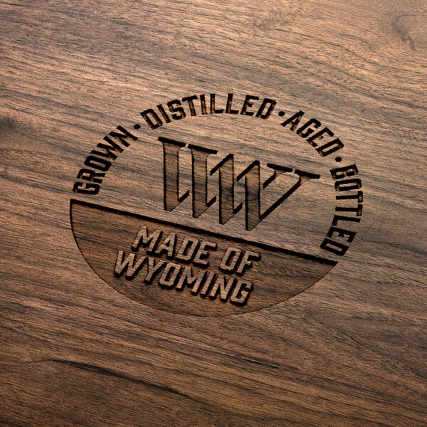
A defining aspect of Wyoming Whiskey, and one that greatly influenced the design process, is that—unlike most American whiskies—every drop is produced, aged, and bottled in one extraordinary location: Wyoming. This rugged and unique origin is central to the brand’s integrity, a quality that deeply resonates with its discerning consumers who value authenticity. The new brand identity needed to weave this story into its assets, highlighting the brand’s unwavering connection to its place of origin and reinforcing its appeal to those seeking a whiskey with genuine roots and craftsmanship.
DEFINING A DISTINCT IDENTITY
As a relatively small brand with ambitious growth goals beyond Wyoming state, Wyoming Whiskey’s inconsistent use of brand assets hampered its marketing efforts and diluted its overall impact. In a crowded and competitive whiskey market, the brand’s visual identity struggled to stand out. The prevalent “dark world” aesthetic, widely adopted by competitors, further obscured its differentiation. To achieve the brand’s aspirations, it was crucial to establish a distinctive and cohesive identity that would set Wyoming Whiskey apart, clearly communicating its unique value proposition and captivating new audiences.
REFINING THE ASSET SUITE IMPACT
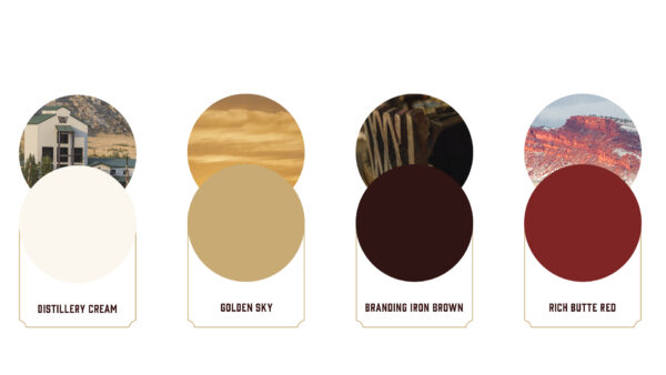
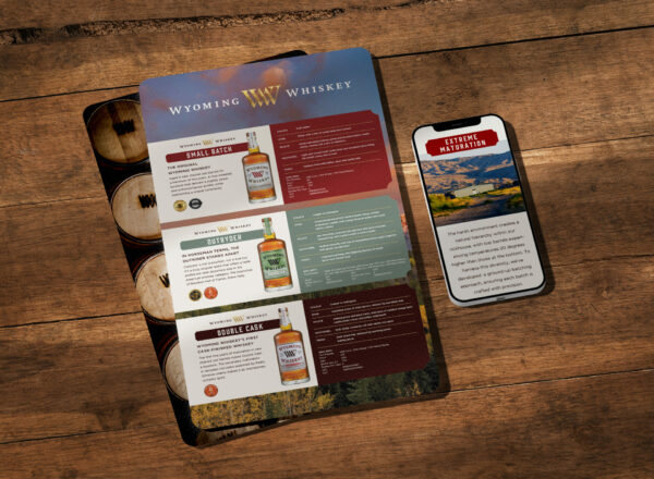
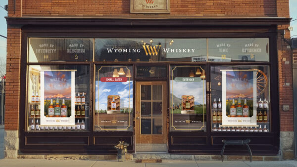
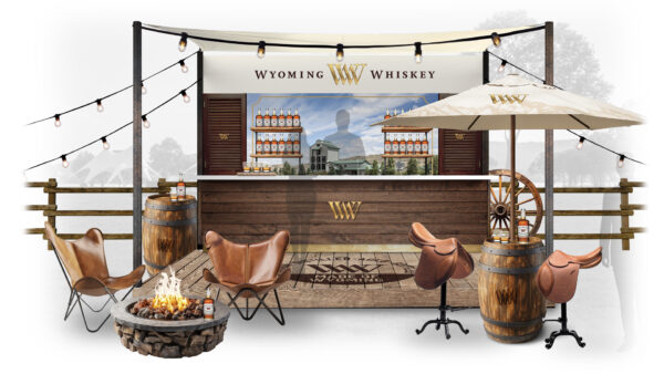
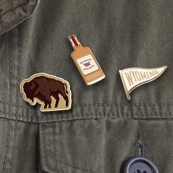
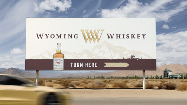
The existing brand assets had multiple orientations, size relationships and therefore were a challenge to create consistency when applied across touch points. Before embarking on the design process, it was crucial to review all touch points to ensure the final identity would be both cohesive and easy to implement. This evaluation also had to align with the rugged luxury aesthetic that Wyoming Whiskey aspired to. A starting point was determining the role of each unique asset within the brand identity, including refining the logo suite, developing a colour palette with intentional meaning, balancing a lighter colour usage and establishing a distinctive photography style. All assets were designed to work harmoniously, anchored by a set of design principles that reflected the brand’s core positioning.
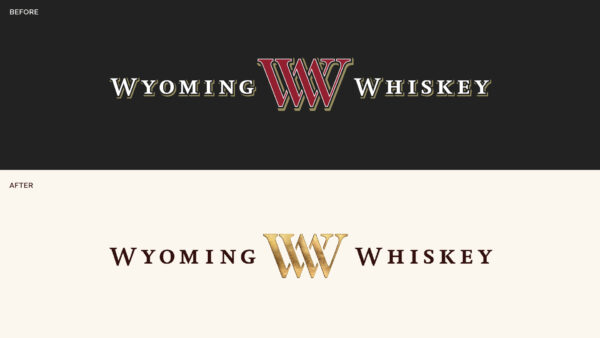
CRAFTING ICONOGRAPHY WITH PRESTIGE AND PROVENANCE
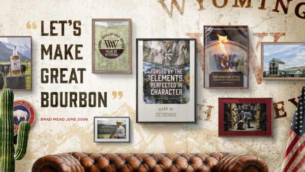
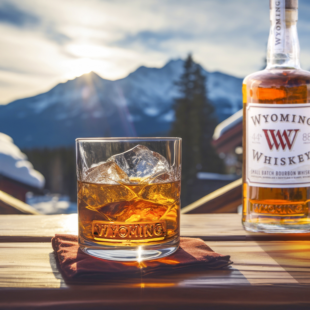
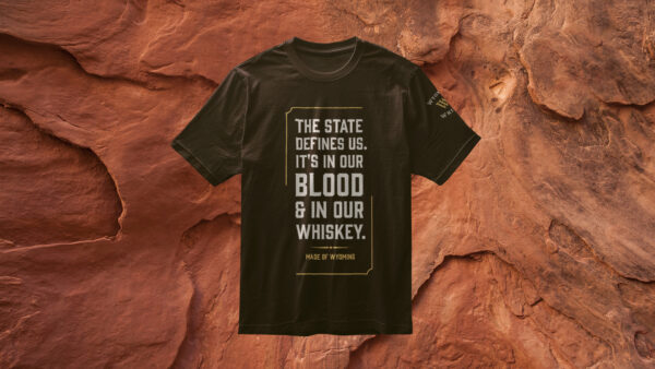
To tackle these challenges, we developed an iconic “WW” symbol at the heart of the brand identity—a luxurious representation of the cattle branding iron used on every barrel of Wyoming Whiskey (to our knowledge, a practice unique to the brand). This new icon became the cornerstone of a revitalised brand identity, acting as a visual shorthand for the brand’s core values and ambitions. The word mark was redesigned with a lighter, more open feel, projecting an air of refinement that mirrored Wyoming’s vast, open landscapes.
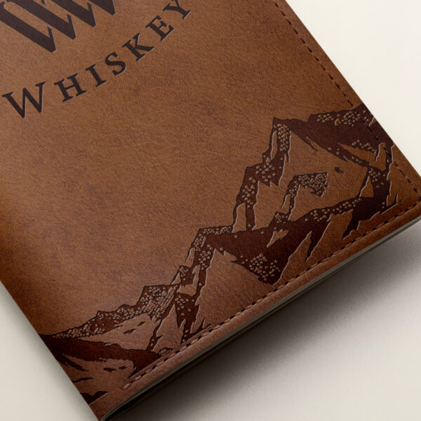
RUGGED LUXURY IN EVERY BRAND WORLD DETAIL
To further capture the brand’s unique story of producing whiskey entirely in one place, we introduced a supporting asset that emphasised this aspect. Using the semiotics of rugged luxury, we carefully selected materials, artwork, and tone of voice to create a cohesive brand world. Each design element—from textures to typography—was meticulously chosen to evoke a sense of rugged elegance, reinforcing Wyoming Whiskey’s positioning in a way that was both aspirational and authentic. This comprehensive design approach brought the brand’s values to life for consumers, ensuring that the new identity resonated on every touchpoint.
ENSURING SEAMLESS BRAND IMPLEMENTATION
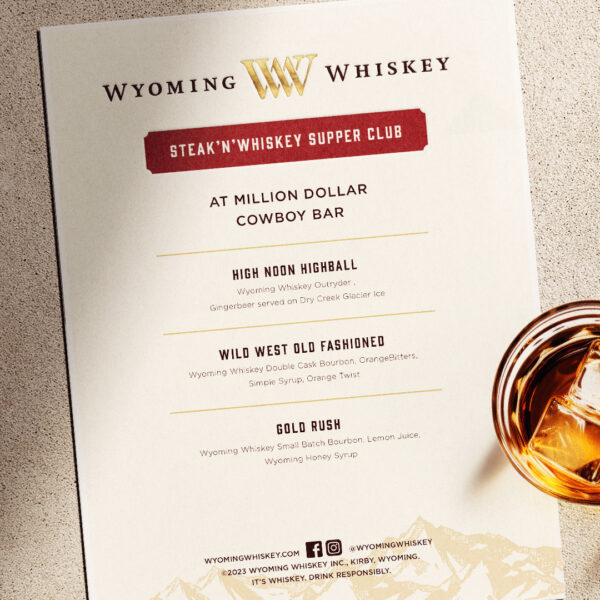
To guarantee the successful and consistent implementation of the new branding, we developed comprehensive guidelines with each element accompanied by a clear rationale. These guidelines provided detailed instructions on the correct usage of all brand assets, ensuring that every stakeholder—from internal teams to external partners—could easily adopt and apply the brand elements across diverse touch points. By simplifying the application process, the guidelines fostered a stronger, more cohesive visual identity, elevating the brand’s impact and recognition in the market. This structured approach ensured that the brand’s essence and values were maintained, no matter where or how it was presented.
DISTINGUISHED RESULTS
By resolving the inconsistencies and complexities of its previous branding, the new Wyoming Whiskey identity significantly enhanced both usability and brand perception. This evolution successfully elevated the brand into the rugged luxury semiotic space, better aligning it with the target demographic’s expectations of quality and refinement from a prestige whiskey. The refined brand assets helped distinguish Wyoming Whiskey from competitors while supporting its prestige aspirations. The comprehensive guidelines and rationales ensured that the brand’s identity could be consistently implemented and maintained, securing visual coherence and reinforcing its growing market position.